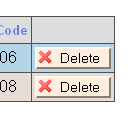
I recently saw a post via reddit on Rediscovering the button element about making nice buttons with little icons, and was introduced to the Silk Icons available from Mark James. Mark has released these under a Creative Commons Attribution license, any my UIs will be better for it.
I went through last night and gave a little face-lift to one of my intranet projects, and it looks a lot nicer now. I added icons to buttons and links using CSS.
Here’s the css I used:
[css]
.icon
{
background-repeat:no-repeat;
padding-left:20px;
}
.delete-icon
{
background-image:url(‘icons/cross.png’);
}
.edit-icon
{
background-image:url(‘icons/pencil.png’);
}
[/css]
and so forth, with a *-icon for the different icons I wanted. Then, I decorated my buttons, links, and what-have-you by adding a class="icon foo-icon" attribute. There are other ways accomplish that with CSS, but I liked this scheme the best. In the end, I have added nothing significant to the markup, but made everything else look a lot nicer:


Thanks a lot, Mark!