Everyone had the day off, so I decided to work on making a graphing library. I’ve been on a fairly constant quest for easy data visualization, running through several options:
- homegrown SVG renderer (javascript)
- homegrown png renderer (C#)
- Gruff (ruby)
- some graphing capability from Dojo (javascript)
- cl-plplot
I’ve never been happy with any of these, for a few reasons:
- SVG support for IE is a pain
- C# requires a million objects to do anything
- Gruff had good defaults, but had some annoying bugs, and I ended up jumping through a lot of hoops to get some basic aggregation going. I looked at monkey-patching gruff, but that seemed like a really bad idea
- The dojo charting was slow, and the setup was verbose (this may have changed)
- cl-plplot output wasn’t very attractive. Great for scientific usages, but for business apps it didn’t have enough rounded edges.
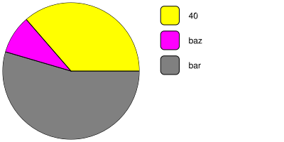
I want something that’s concise, has good defaults, rendered to PNG, and is easy to use from lisp. So today I tried rolling my own, and I’m pretty happy with the results:

The code to generate this graph is pretty concise, too:
(defun pie-chart-sample ()
  "draws a simple pie chart, rending to pie-chart-sample.png"
  (render-chart
   (make-instance 'pie-chart
		  :data-items (make-items '(40
					    (10 "baz")
					    (60 "bar" (.5 .5 .5)))))
   "pie-chart-sample.png"))
This demonstrates a few things:
- data can be specified as value, a value/label, or value/label/color
- it automatically choses colors if unspecified
- the labels are automatically positioned off to the side
There’s still some places to cleanup the API, I don’t like having make-items in there, and a lot of the behind the scenes is messy as all hell.
I started by looking at the source for Paragent, a lisp-based IT management tool. I first saw really attractive graphs coming from lisp there, and it impressed me a lot. It was building on cl-vectors, salza, and zpb-ttf to make png files. There was a lot of weird stuff going on in the paragent code, so I instead opted to port my old javascript code to lisp, using vecto for the rendering.
I ran into a brick wall pretty early when calculating the wedges, as I’ve forgotten just about all the math I ever knew (had to look up the distance formula, for christsakes). The main problem was figuring out how to draw the curved part. I spent a long time staring at Bézier curves before giving up and taking a different approach. I made a circular clip-path (basically a mask) for the chart, and drew big enough wedges to fill the circle, side-stepping my mathematical shortcomings. There’s some goofy code to account for large slices, but it worked for all values I tested.
I did a LOT of learning on this one, working through some package semantics and adding some sparse lisp-unit tests. A few more days worth of effort for other chart types, and I might have something worthy of release.
One Comment